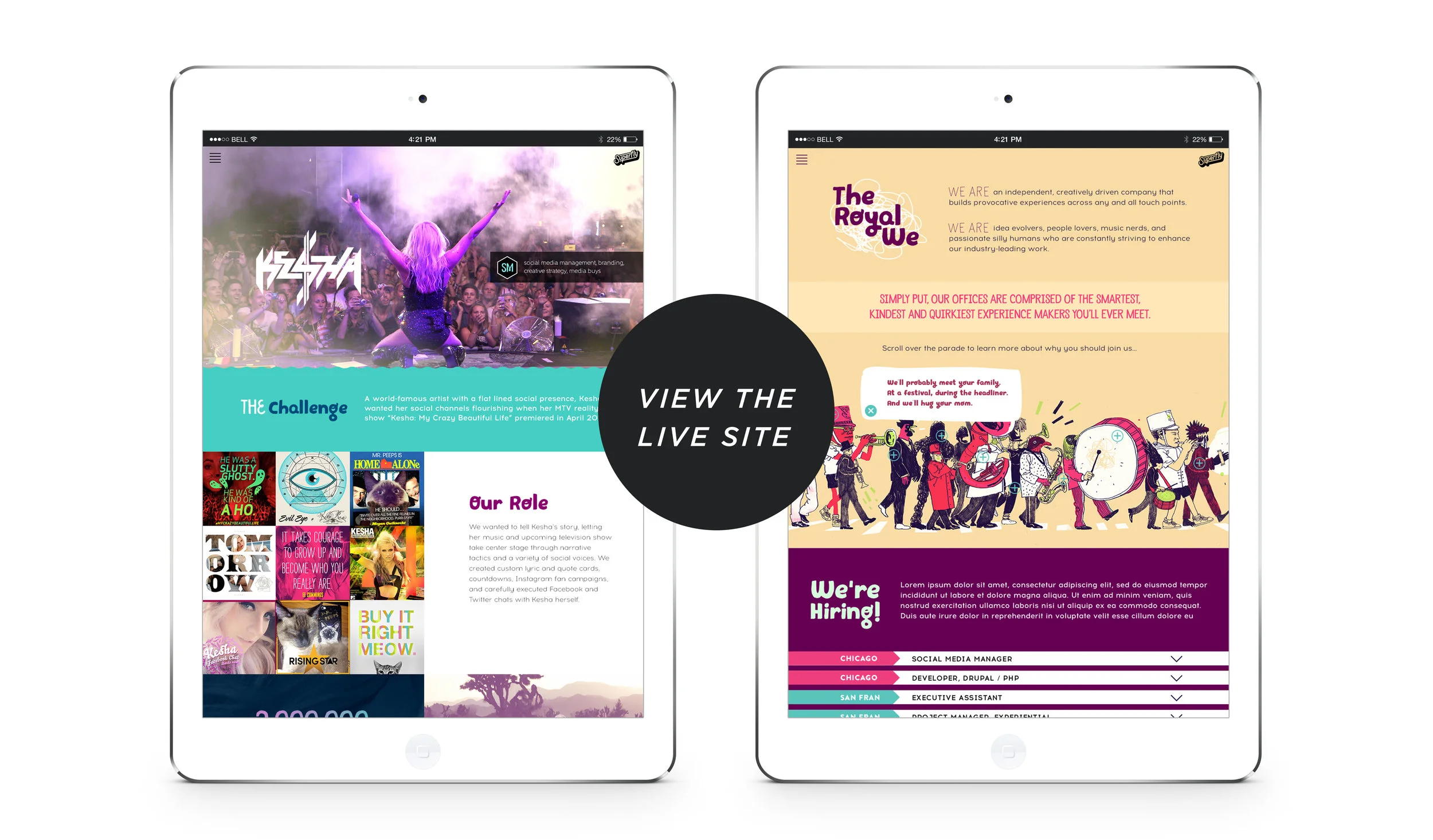
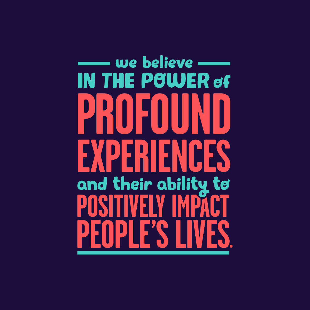
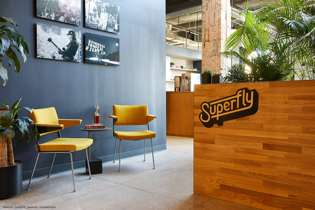
For almost a decade, the world-class event producer Superfly had very little personal branding. The goal was a complex one: Curate a versatile branding system that balanced Superfly’s youthful personality without sacrificing the company’s professionalism. Equally challenging was the need for the branding to artfully co-exist with any potential festival or client branding without clashing.
I managed the design team through the brand exploration and art directed many of the components of Superfly's new aesthetic. I also insisted on using flexible components and basic guide rails to start, which allowed us to test and strengthen elements of the branding over time. In the end, the branding system successfully combined the business goals and unique desires of company stakeholders while maintaining strong design standards as a result of rigorous use testing.
And if you were curious what the old logo looked like, see below!


